Related Post

If you have a business that relies on client appointments, we understand how much effort it takes to plan and handle your calendar. the client or patient calls you...

What is an FAQ page? FAQ meaning “frequently asked questions”. Fag page is often public on the website to be asked and answered. Every time when a customer asks you...

With the development of e-commerce in recent years and the strong increase of using e-commerce as the most convenient way to shop online, especially in 2020 because of the...
Other Usefull Contents
You can see many success stories from our customers, and you may be one of them in the future

With the pandemic driving more consumers online, e-commerce is booming and offers an opportunity for entrepreneurs to start their own businesses.
Read More
With the growing competition in the e-commerce industry, building a strong brand identity is crucial for the success of any e-commerce website.
Read More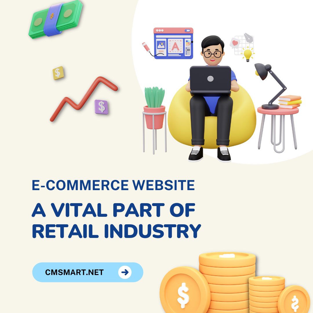
With the great huge benefits of an e-commerce website, this type of business operation is blooming across the world in different fields. On the other hand, some challenges still exist.
Read More


In 2017, just only US, 156 billion dollars was spent in mobile ecommerce and this figure is expected to increase significantly in 2018 and beyond. Google also starts to prioritize the websites which are mobile friendly. So, it’s time for you to optimize your site for mobile users and checkout process is not exceptional. How? This article will provide you 7 recommendations
If you haven’t optimized your website or checkout page for mobile devices, it means that each time customers go to this page, they have to rely on pinch and zoom to be able to see clearly what they’re doing. Nightmare with any users. Customers will abandon immediately because no one is patient enough to put up with it.
Some customers said that they felt unsafe when checking out online. What I mean here is not the security. Let’s think about the fact that, when you go to checkout process with multiple steps, each time you find yourself writing wrong information (just suddenly remember) you have to load back, wait and then fill again. Too complicated and waste time. The only solution for this issue is applying one step checkout process by removing all distractions on the page, and just give them what they need.
Visitors may be more forgiving with a quick typo in a blog post but it is more serious in checkout process when everything needs to be clear and accurate. Even when they already decided to buy, grammar error can also cause some negative feeling. You provide good product quality but your site appears with a poorly written text that is sloppy, unprofessional, and untrustworthy. Customers might feel that you don’t respect what you provide them.
It will be always the best if customers register with you and you can contact them to promote more sale; however, asking them to register before making purchase really slows down the checkout process and it will annoy customers, especially people who use mobile devices. To provide the best UX, you can give customers two choices, register before checkout if they want, checkout as the guest if they don’t want. They can check out faster and still can register later if they feel necessary. One solution to encourage customers to register is incentivizing with a coupon code or special offer for new members.
Using finger to touch is totally different from clicking by the mouse cursor, the finger is much bigger. Therefore, mobile buttons should be a bit bigger to be readable and clickable. Amount of distance between them is also the thing that you should calculate carefully.
Filling checkout form with endless fields and unnecessary information will be never a good choice, it’s nothing short of a pain. That’s the reason why we suggest you simplify checkout form. The less they have to do, the more likely they are to complete the checkout process and return as a customer.
One more recommendation for checkout form is when customers fill the form, let’s make everything become more convenient by auto-populating certain parts of it for them such as ZIP code, address.