Related Post

In the dynamic world of printing, success hinges on more than just the quality of your products—it's about efficiency, innovation, and staying ahead of the curve. That's where CMSmart...

In the ever-evolving landscape of printing services, meeting the diverse needs and preferences of customers is paramount for success. Ctrl Copy & Print, a leading printshop, has embarked on...

In this narrative, we delve into the transformative journey of businesses that have harnessed the power of CMSmart's comprehensive suite of services. Discover how CMSmart, as a dedicated partner...
Other Usefull Contents
You can see many success stories from our customers, and you may be one of them in the future
If you intend to start an online business but don't know which industry you should join, a suggestion for you is digital printing. As you know, along the roads, from urban to rural, signs from simple to complex are displayed a lot on the street.
Read More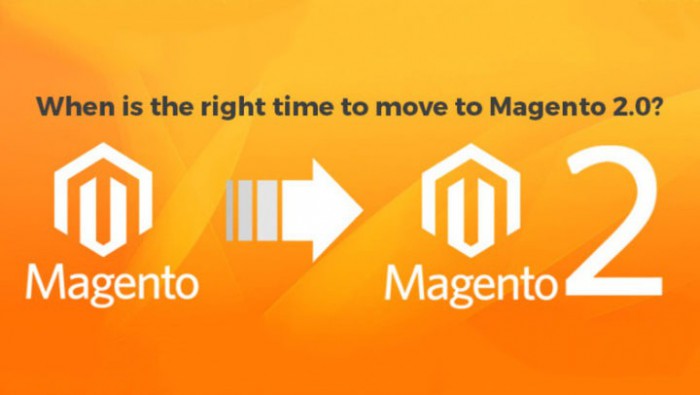
Recently, we have heard enterprises have been talking a lot about Magento 2 migration because they've considered it as the big expansion plan of business. It seems to be true for enterprises but is it for both small and medium business? Whether they shoul
Read More
There is a fact that web owners usually overlook to optimize SEO for Magento product pages. I found that a lot of merchants with a large catalog and use generic product descriptions and images provided by the manufacturer forget this aspect.
Read More


Usability of your website might be a supporter of your sale but if you do not design it properly, it will become a threaten. This article for Magento site, I will focus on how Magento extensions protect your website from usability issues:
1. Load time
Visitors, nowadays, are accustomed to fast web pages and I bet that they have no reason to stay on a slow website. Visitors are not such patient. From the beginning, I recommend you to choose a server that will be able to accommodate your website’s traffic and data needs. Stay away from the unnecessary animations and large images, the speed will be improved significantly.
2. Navigation
Benefits of horizontal mega menu:
Benefits of vertical mega menu:
Refer:Magento Layered Navigation extension and Magento Mega menu extension, Magento Calendar Printing Website ThemeMagento frequently bought together extension
3. Checkout Process
Don’t require registration: Registration should never be compulsory when customers make a purchase, you only should encourage them to register by giving them some benefits.