Related Post

If you have a business that relies on client appointments, we understand how much effort it takes to plan and handle your calendar. the client or patient calls you...

What is an FAQ page? FAQ meaning “frequently asked questions”. Fag page is often public on the website to be asked and answered. Every time when a customer asks you...

With the development of e-commerce in recent years and the strong increase of using e-commerce as the most convenient way to shop online, especially in 2020 because of the...
Other Usefull Contents
You can see many success stories from our customers, and you may be one of them in the future

With the pandemic driving more consumers online, e-commerce is booming and offers an opportunity for entrepreneurs to start their own businesses.
Read More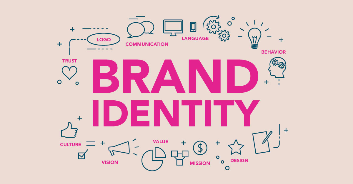
With the growing competition in the e-commerce industry, building a strong brand identity is crucial for the success of any e-commerce website.
Read More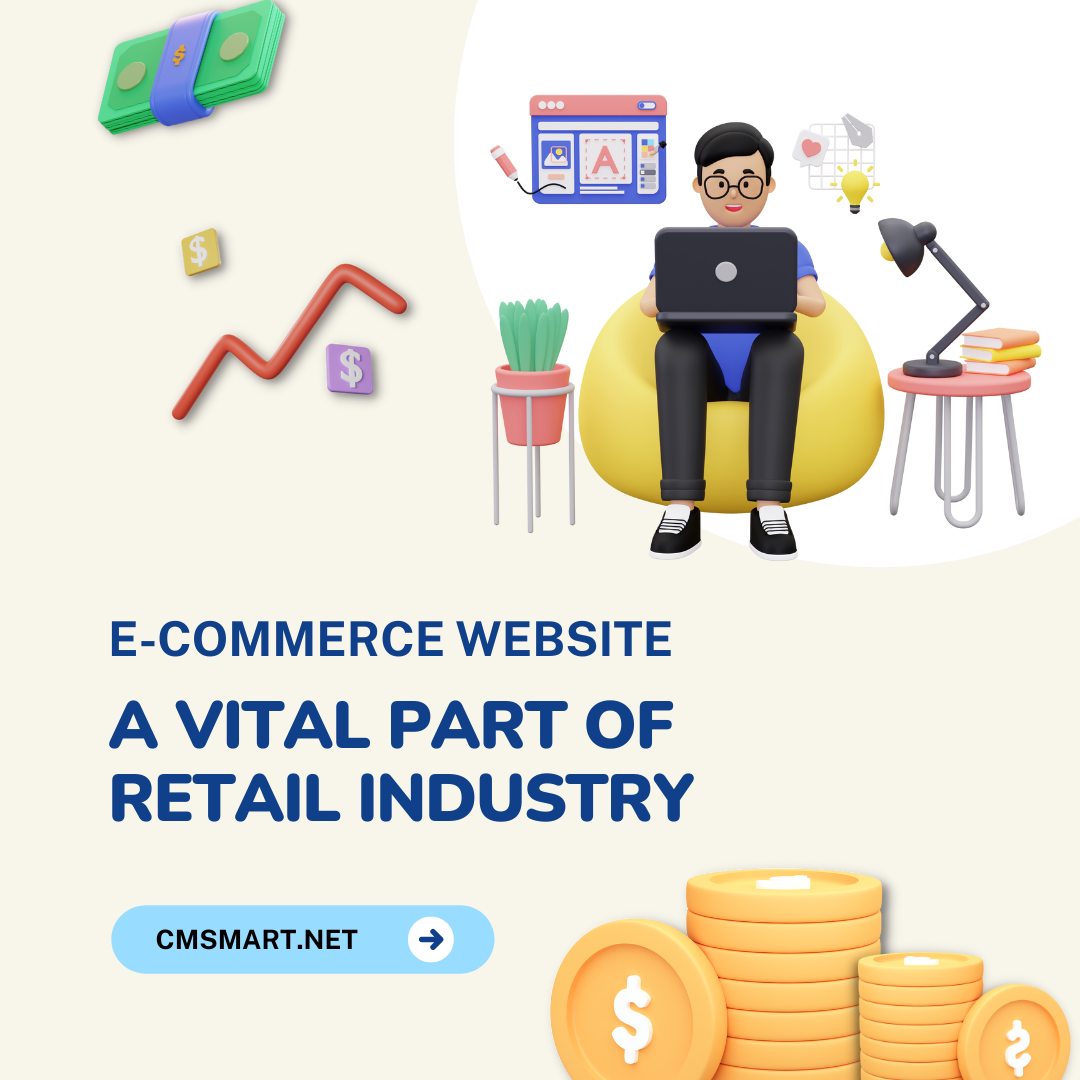
With the great huge benefits of an e-commerce website, this type of business operation is blooming across the world in different fields. On the other hand, some challenges still exist.
Read More


To answer the question mentioned in the title, firstly, we should have a brief definition of utility navigation. In short, it is the navigation that is not closely related to the content and it supports users to perform different actions. To design utility navigations requires you to find the necessary elements, organize them reasonably and impressively, keep in mind that, the display needs to be convenient for visitors to find and understand its operating principles.
How Utility Navigation Impacts UX
Before starting to design, you should identify the way visitors interact with websites. After that, you can build a rational interaction system that can match your business goals and give customers simple but useful options as well as a pleasant user experience.
Although how complex and perfect system you want to build, never forget the first requirement is rapidly responding to what customers desire. Only when you perform, do customers tend to spend more time with your sites.
The second important thing is to always keep the sites clean, simple and professional. Adding too many superfluous utilities cannot make customers feel they are benefited, otherwise, these utilities will cause distraction and reduce focus. You should pay attention to choose what is needed and what should be rejected. There are 3 main utility navigation items visitors usually want to use site-wide: search tool, Sign In, and Subscribe in the fixed top bar.
The third requirement is quickly making visitors know what they can do with functions in your sites and you also need to provide information about each option as detailed as possible.
Finding the Best Place
There will be several certain positions that are the ideal place for utility navigation because visitors usually find and use the tools on the majority of websites. Utility navigation is more about usability rather than creativity.
Although utility navigation is usually put at less noticeable positions, it still needs to be invisible areas: top-right corner of websites or lower part of the footer. If you tend to break this web design convention, you may have problems with bad user experience practice.
Building a Logical Structure
The way you organize utility tools into a logical structure will have great influence on the conversion rate. Let’s see Amazon. They make a difference by arranging utility navigation into 3 main groups instead of on the top-right corner. Three positions are a search bar, user-related information and actions that users can perform on the site. Many users agree that it is the magic of smart design.
Creating an Effective Visual Design
Do you know the famous KISS principle (Keep It Simple, Stupid)? In more clearly explained, it means that you should provide icons with text labels, make controls appear like controls, and visually emphasize the most important actions. At the higher level, you can separate utility and content-based navigation clearly by using a different design for each.