Related Post

If you have a business that relies on client appointments, we understand how much effort it takes to plan and handle your calendar. the client or patient calls you...

What is an FAQ page? FAQ meaning “frequently asked questions”. Fag page is often public on the website to be asked and answered. Every time when a customer asks you...

With the development of e-commerce in recent years and the strong increase of using e-commerce as the most convenient way to shop online, especially in 2020 because of the...
Other Usefull Contents
You can see many success stories from our customers, and you may be one of them in the future

With the pandemic driving more consumers online, e-commerce is booming and offers an opportunity for entrepreneurs to start their own businesses.
Read More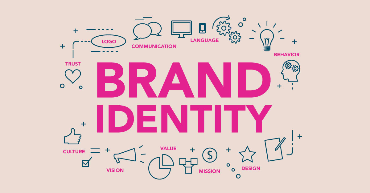
With the growing competition in the e-commerce industry, building a strong brand identity is crucial for the success of any e-commerce website.
Read More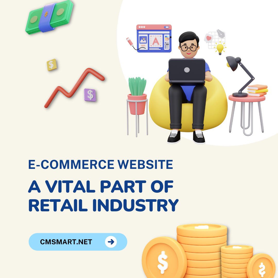
With the great huge benefits of an e-commerce website, this type of business operation is blooming across the world in different fields. On the other hand, some challenges still exist.
Read More


The mistakes we mentioned in this article may not cover all the mistakes of all website but they are the most common. We hope that this article will be helpful for the online shop owners who are finding the answer for the big question “Why their website does not run so well?”.Here is the list for you to refer:
Of course, you may say that asking information is also the way to show that you are taking care of customers. But, you should recognize what is enough. A lot of customers feel annoyed just because you ask too much information related to details in a registration form, especially in the checkout process while they just buy a very simple product. In order to deal with this problem, you should:
See more: One-page checkout, reasons why to choose
Poor product details will reflect two cases: one is your product is not good, the quality is also poor as in product details page and the other case is that you are also not confident about what you are selling, so how can you give customers the proper advice? It is the shortest way you break customers’ trust. You should display your products effectively in terms of images, text, font, etc. Some tips for you:
It means complicating. You may want to show all the best things for visitors but have you ever thought that visitors feel overloaded and confusing, especially when you overdo with your homepage. When they want to search for some information but there are too many things on your site but it lacks the basic information, we beg that those visitors will leave your site just in a few seconds. You know the statement: LESS IS MORE? That’s so useful for this case. What you should do is:
NEVER OVERDO!
Your customers do not just use the desktop to approach your site, they have smartphones, tablet, laptop, etc. Don’t forget this fact when you design your website because the amount of smart devices users even exceeds desktop users. You don’t want to lose, you want more sale revenue? Making sure that your site will work well with both desktop and those smart devices.
If you are coping with one or more mistakes we mentioned above, you can follow some tips provided to fix, or in case you desire more professional support, you can ask for some eCommerce web design services to re-design your e-store! Good luck with your sale!