Other Usefull Contents
You can see many success stories from our customers, and you may be one of them in the future
Have you ever been shopping online? If the answer is yes, I believe that you might hear at least one time about the term One Step Checkout.
Read MoreWe are living in the Digital Age which provides extraordinary opportunities for people who have the right expertise, skills and mindsets because they will transform their organizations and disrupt industries using new business models enabled by a wave of
Read MoreLet’s enjoy fantastic saving from CMSmart with amazing prices. It’s the great time to spend on a total e-Commerce solution which consults for all e-Commerce business.
Read More
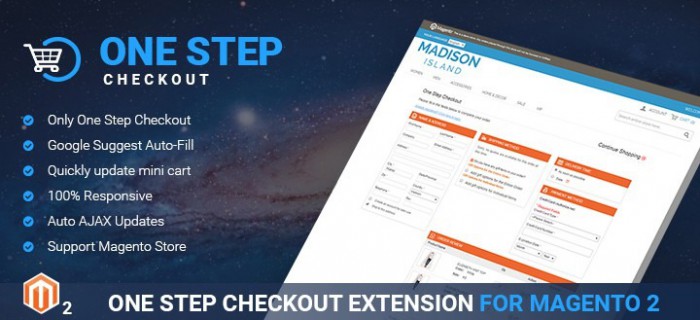



One step checkout is designed with the aim of helping customers finish checkout process completely without loading additional pages. Web developers believe that One step checkout will make customers closer to completing their order so the conversion rate will be improved. Moreover, this kind of checkout process will occupy less real estate, it means that less information has to be filled out. All non-essential form fields will be cut down to make checkout process succinct.
In fact, we have several ways to improve checkouts to bring customers excellent user experience but in this article, I want to show you the deep view over optimizing checkout as a whole with Magento 2 one step checkout extension from Cmsmart:
What does it mean by simple?
Magento 2 one step checkout extension allows you to inform customers about some payments other than the cost of the item such as time and price associated with each shipping method so your customers can be more confident in their purchase.
Let's make your customers be confident that their choices are right by providing them all needed information. For example, with Magento 2 one step checkout extension, when they submit an order, give them a way to cancel the order before it’s processed and a printable order confirmation page with all the order details.
There are some factors affecting obviously on the ease and usability of forms including not crowding forms, tailoring field length to the size of the information being entered inline validation for inputs that have high error rates.
You also should pay more attention for a great deal of information about form labels. From the point of view of professional designers, the suitable form field labels are above each form field. You will see its huge influence on usability and brand perception.
We understand that one step checkout process is designed for place order page so with Magento 2 one step checkout extension, we design total cost prominently near the CTA for placing an order and that once clicked, the order will be submitted. We help you avoid the duplication by disabling the “Place Order” CTA after the user clicks once, if it is still possible, inform customers just click one time to avoid multiple orders.