Other Usefull Contents
You can see many success stories from our customers, and you may be one of them in the future
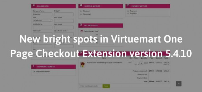
The world is changing, and changing fast. Over a year since the last update of the Virtuemart One Page Checkout Extension, the Virtuemart Platform had had much big change.
Read MoreShopping cart abandonment is one of the serious problems of any e-commerce website owner. We cannot solve this problem because you know that the right to make a purchase or not belongs to the customer.
Read More
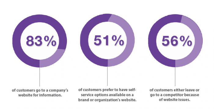






In the world of eCommerce, cart abandonment is the most mournful thing in an otherwise flawless shopping journey. There are many ways to low down cart abandonment but the best way is to bring your customers the most convenient way to pay. Therefore, this post we will talk about the reason why you should choose One Page Checkout.
A. The powerful of One Page Checkout
1. Speed & convenience
If you’ve filled out your fair share of forms online, you understand how frustrating and long the process can be with multiple pages to deal with.
Even if you’re asking for the same information as multi-page checkouts, the shorter appearance of the one-page checkout can work wonders on your conversion rate.
There’s no question keeping everything on one page is a lot faster. The fact is, one-page checkouts can slice that checkout time down by a minute. Only by one minute you can low down the cart abandon about 60%, it’s a huge number of sales. With everything gathered together, users don’t have to worry about loading times when switching between multiple pages and can easily see any errors should they arise.
Customers don’t need to enter their details again to add the additional item to their cart, they simply click on the upsell popup and it’s added to their order! It will elevate the checkout experience while leveraging the speed and convenience of the one-page checkout.
2. Ease of use
Shoppers can fly through the required information they need to input when it’s all gathered together in one spot. With limited space available you’re only asking for the required information, which ensures you’re not overcrowding the page.
As a bonus, if people find the process hassle-free they’re more likely to come back, becoming valuable repeat purchasers!
3. Clear navigation
Customers can easily see how far along they are in the checkout process, without switching back and forth between pages, making the checkout journey much more straightforward.
Abandoned carts are less likely to happen if shoppers have already completed a majority of the required forms, or can see there are only a few simple steps to complete before the product is all theirs.
4. Fewer clicks
According to research, the fewer clicks a customer has to make, the higher the rate of conversion for sales. Which makes sense – the less work required, the quicker the reward!
That’s why a one-click upsell works great! If you want to add on some additional revenue while offering your customers relevant products they’d be interested in, consider using an upsell after checkout.
B. Why isn’t everyone using the multi-page checkout?
Well, there are some obvious drawbacks that lead to frustration for many customers.
1. Length of checkout
Landing on a site only to find several long pages full of fields is daunting, to say the least, and can cause even the most serious shoppers to flee.
In fact, research shows that users are overwhelmed just at the sight at a large number of form fields.
Many people don’t want to take the time to navigate through a long and complicated checkout, especially when technology has advanced to a speedy, faster-is-better mentality.
If the checkout is taking too long, shoppers may get distracted, bored or frustrated and give up. Or not, you need to restricting inconvenience by including a progress bar at the top of each page. That way, customers can see exactly where they are in the checkout process.
2. Complexity of checkout
In general, the more pages involved in the checkout, the greater the chance of cart abandonment.
One out of four consumers is abandoning the cart due to a long, complicated checkout process. Or in other words, 25% of your customers. That’s definitely not a number you want to ignore!
C. Conclusion
When choosing features for your site, the most important thing is allowing international customers to shop and pay in their own currency, multiple language support, price rounding, payment capture on shipment and many more.
Every store will have different needs, and those may change with time or as your store grows. With Virtuemart One Page Checkout, you have the freedom and flexibility to change checkout styles at any time. Remember that the main goal is to make it as easy as possible for your customers to complete the checkout process.
Abandoned carts are bound to happen for a number of reasons, but one of the best ways to prevent them is to optimize your checkout page for your store.
Vincent
Sales Consultant Manager
Skype: live:vincent_4281
Phone/ whatsapp: +84 978 847 058
Email: [email protected]