Other Usefull Contents
You can see many success stories from our customers, and you may be one of them in the future
If you intend to start an online business but don't know which industry you should join, a suggestion for you is digital printing. As you know, along the roads, from urban to rural, signs from simple to complex are displayed a lot on the street.
Read MoreRecently, we have heard enterprises have been talking a lot about Magento 2 migration because they've considered it as the big expansion plan of business. It seems to be true for enterprises but is it for both small and medium business? Whether they shoul
Read MoreThere is a fact that web owners usually overlook to optimize SEO for Magento product pages. I found that a lot of merchants with a large catalog and use generic product descriptions and images provided by the manufacturer forget this aspect.
Read More


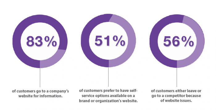
Any merchants who want to take a piece of profit cake in trading all understand the power of information technology as well as the spread of the Internet. Most of them, at this time, own at least one online store as a way to maximize their sale revenues. However, not all of them can take advantages of online stores properly, that is an undeniable fact. The low conversion rate is the most obvious proof online merchants can observe. They almost forgot a very crucial component of an ecommerce business: online store usability and cannot make the purchasing process become simple and easy.
There are thousands of reasons for customers to leave your websites, one typical example is too complicated navigation. It will waste a lot of time for customers to learn how to use your website while many other websites with the same products are available for use. So that, don’t lose your competitive advantages due to these problems. To deal with troubles, you can find eCommerce usability guidelines online that can provide you the way to improve your store usability and get the lower abandonment rates.
Another common problem of almost websites is usability as mentioned above. A suggestion to find and resolve usability problems as well as reduce abandon rate is:
In short, Magento usability audit means a detailed analysis of store’s usability that has no support from automation software, it will help users to overcome obstacles and explore all potential of online stores.
Usability audit measures both quantitative and qualitative data. Numerical data is collected mostly by Google Analytics to answer WH questions (who, what, when) but not why and how. To fulfill why and how questions, you need to use usability testing tools and methods.
Overall, combining numerical data with qualitative data measurements is actually important to draw the whole picture about users’ needs, detect possible flaws and compile a usability audit report.
In case, too many issues exist, it is more feasible and effective if you create everything from scratch, incremental redesign strategy is usually highly appreciated to minimize risk, stimulate ROI and improve web stores continually.
Another recommendation is switching from carousel to an alternate way of showcasing important information on the homepage. One fact we want to mention is several merchants decide to have designers copied the model from successful competitors. Is that good? It’s up to you.
A/b test, look quite simple but effective. When you hold enough data, conversion goals and design iterations can be set up. You should run an A/B or split test to find the most reasonable answer, going with the version A or version B. It is an experiment between different designs versions of the same page used to test potential improvements. The winner in the test will be applied without any hesitation.