Other Usefull Contents
You can see many success stories from our customers, and you may be one of them in the future
Nowadays, the e-commerce website is developing high-quality technology. Your website becomes more beautiful and attractive. Especially, category items must be clear and much useful information displayed in the best design.
Read MoreOn any website, Top menu is the most essential function. There are categories of products and services as well as contact information on it. Do you know how long customers stay on web pages? Surprisingly, it’s only 10-20s on average (NNGroup, 2011). There
Read Moreyou may gain the overview about usability advantages of mega menu. But it is just very overall view, in the rest of article, I will show you why Magento 2 mega menu is the must have Magento 2 extensions for your eCommerce website:
Read More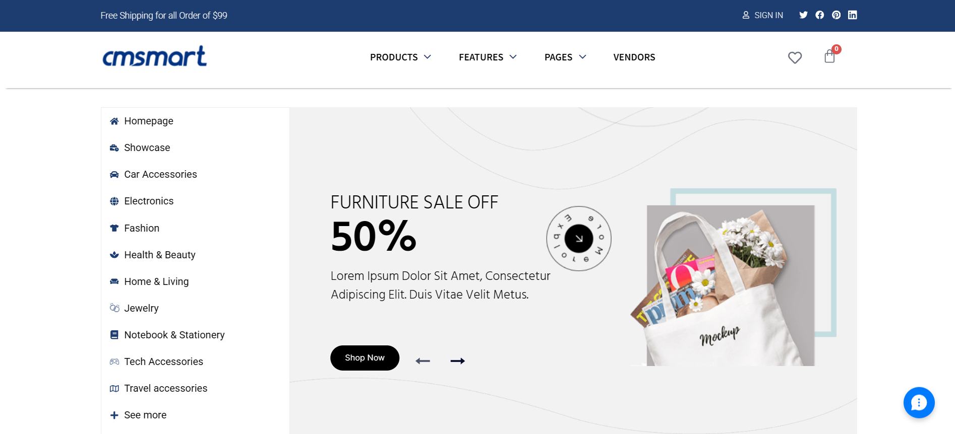
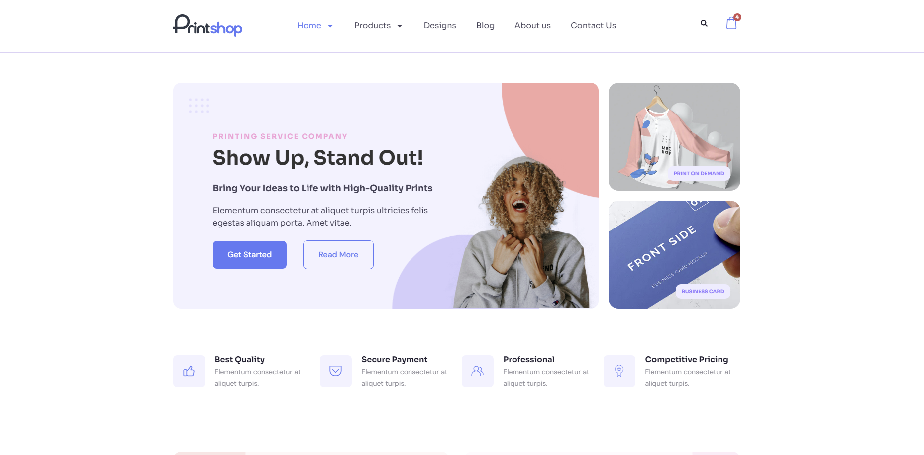
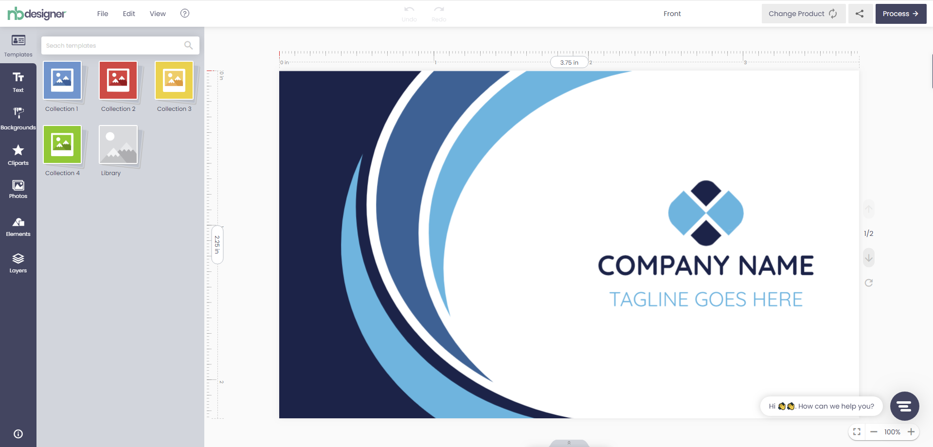



With a digital printing website, the website design and navigation should be flawless because even one mistake can cost you heavily. The main functions of navigation on printing website are:
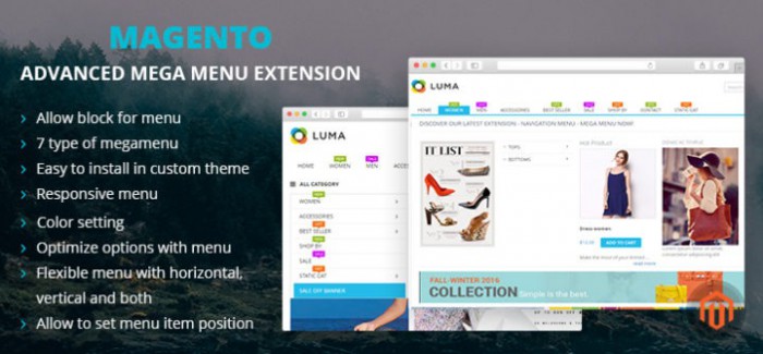
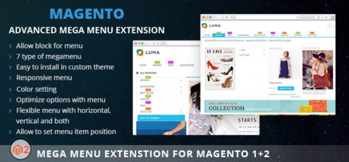
In this article, we will focus on how Magento 2 mega menu extension helps you to create perfect web navigation. Here we go:
1. Follow KISS principle
KEEP IT SHORT AND SIMPLE! Yup, always remind yourself. The trend these days is to be very selective as a navigation with a huge text is a super flop idea that can do more harm than benefits. However, users might be confused that if a mega menu is too simple, will it provide enough function? Don’t worry, Magento 2 mega menu extension packs the complex things in simple packing that looks more appealing. This extension ensures that the navigation is easy to understand for a user regardless of that website is for retailer or marketplace model. Our purpose when creating Magento 2 mega menu is making navigation simple and powerful enough to drive the customers to the respective product.
2. Responsive navigation
Responsive in navigation will bring you the higher level of professional web owner. Based on the rules of the flexibility of layouts, images, and the main aim is to build web pages that can detect the visitor’s screen size and change the layout accordingly, our Magento 2 mega menu was released with so strongly responsive design. We understand that the giant Google has been rating the sites at a higher range if they are mobile friendly, so responsive design is always prioritized.
3. Friendly language or multi-languages
That customers can use your mega menu or not will depend a lot on the language used. Although English is the standard, not all people can use it, the language used should be familiar to the user to get the most benefits. That’s the reason why Magento 2 mega menu comes with multi languages supported. We want customers to feel comfortable when they use mother tongue while visiting the website.
4. Orientation
Horizontal navigation seems to be more balanced, also easy to place while today vertical navigation is much more popular especially on e-commerce sites as it helps a person to finds products/services easily in a catalog and avoids much clutter. Magento 2 mega menu offers you three solutions: horizontal menu, vertical menu, and the mix of horizontal and vertical. Let’s make your web navigation be like a clear map that drives the users towards internal pages to explore your website.
5. Stay consistent
The consistency will build the trust among your visitors. Magento 2 mega menu follow the rules for consistent navigation that are nice and clean navigation and all items on the menu are linked to internal pages they meant to be. We also add secondary navigation and it also follows the rule applied before because regardless of anything you create, the final purpose is still improving UX.
The last words,
Magento 2 mega menu extension makes your web navigation become user-friendly and convenient. Regardless of which industry do you belong to, navigation still plays an important role in improving UX.