That's what one of our clients, Jessica, told us. She was running a small mug store on WooCommerce—sales were okay, but stuck.
Until she discovered personalization.
Until she discovered Cmsmart.
Fast-forward 30 days:
- ✅ Her store was redesigned with AI product options
- ✅ Customers could design their own mugs with 3D preview
- ✅ AOV jumped by 42% — and she finally felt in control
Want to learn how she did it (and how you can too)?
🎓 Join our FREE 30-Day Email Course:
"Personalize, Launch & Scale – The Smart Ecommerce Way"
You'll get:
- ✔ 1 lesson a day, straight to your inbox
- ✔ Real store examples, demos & playbooks
- ✔ No tech jargon. Just strategy that works.


As you know, the website is one of the most effective marketing tools today. The website provides information. But if your website has too much information, it doesn’t look appealing and more importantly. It makes your customers boring and maybe lost them. A great event website can appeal to potential attendees. They can make a decision through by walking your website. So how can you build an event website effectively? Here are Great Event Website Design tips that turners page visitors into excited attendees.
1) Get to the Point!
People tend to look at an event website no more than 10 seconds, so focus on your event's key message. Make sure people can understand what the event is about, find out the time and the address of the event. Try to avoid long-winđe introductions. People are not going to read it, especially if they already have an idea about your event through the invitation link that led them to the site in the first place, Put the date, location and CTA button at the right position and make sure it’s available on each page of your site. If you don’t have a clear key point, people will leave your site
2) Showcase Your Main Selling Points
Let your event stand out. By introducing a well-known guest speaker or high-profile attendees. If your venue is a famous location, you can use large colourful location images that get people excited about the experience
3) Use Strong Visuals
Over the last few years, people care more about event website design, they are putting a lot of beautiful visuals like images, videos, graphics. You can use pictures of your location, guest speakers or facilities you had at your last event. And don’t forget to avoid the picture of people speaking in dingy seminar rooms. If you can’t find the righ photo, try using illustrations in your visual mix. It can easily do for you.
4) Video is a Big Deal
Video content marketing makes a big momentum over the last few years. Eventforce shows that almost all of the event planners are using video to promote their events. Vides do a good fob of conveying the personality of your organisation and help attendees to learn more about your event. They also are many engaging than text – Forrester Research claims that a minute of video can be equivalent to 1.8 million words!
Recordings that naturally play in the foundation can add a great deal to a page however attempt and cut off the ones that play with sound as it very well may be off-putting for certain guests. There are numerous different methods of utilizing recordings on your function site – from spare the-date-recordings and features from your last function to video tributes, interviews with featured subject matter experts and casual blog-style recordings that can include voyages through your scene. Examine this article here for additional thoughts on utilizing video on your function sites.
5) Don’t Forget About Fonts
Many event websites use type fronts which follow the organiser’s corporate guidelines but there are use freestyles. If you have that choice, make sure you have to think carefully about the typography. The font styles decide how customers see the personality of your events. Is it a fun event or formal event?
Web designers used to be limited font types but this no longer the case. There is much selection of fonts. “Arial” is still a popular type as it looks good on all screens.
6) Colour Schemes
Research from QuickSprout shows that 90% of all item appraisals have to do with colour. In fact, colour is 85% of the reason you buy a specific product. So, it's an easy decision for any site that colour affects conversions. But colour can be a tricky thing – you need to utilize it in the right way, at the right time with the right audience.
Again, you might be constrained by your organisation’s branding guidelines but as a general rule, stick to dark coloured text on light backgrounds. It looks great, improves engagement and helps in conversions. It also has the added advantage for those site visitors with visual impairments. Sites with low contrast are difficult on the eye for most people but can be especially difficult for people with low vision – terrible combinations include blue links on black backgrounds or red text on the green. There is no firm guideline with respect to how much difference is sufficient, however, it normally isn't too difficult to even think about figuring out when certain shading mixes don't differentiate well together.
7) Make Site Navigation Easy
Avoid using a lot of drop-down menus because it seems to look messy and take up valuable space on your site. Try to see it through mobile devices.
Gain from your past functions. Examine how guests recently drew in with your function sites utilizing Google Analytics – it can show you the specific excursion guests took all through the site, just as give you some significant understanding on mainstream pages, change rates and where individuals were deserting their enrollments for your function. It's additionally worth testing the route of your site by somebody who hasn't been associated with building it to get a target to see on substance, usefulness and that it is so natural to utilize.
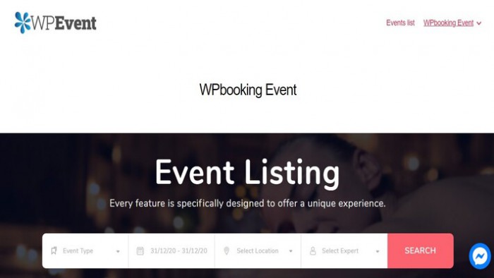
You can see a powerful plugin here. It will Make Site Navigation Easy
8) Registration Needs to be Simple
The overall look of your registration pages depends on the kind of registration software. But try to make your forms as clean and simple as possible. Don’t have lots of texts and don’t ask unnecessary questions. Try to be as simple as you can. For example, don’t ask attendees for their mailing addresses if you’re not going to end up using that information
9) Make it Mobile Responsive
One of the event website design tips today is responsive. It gives your attendees a great user experience when they view your event website. A responsive web design also helps to improve with SEO. Google favours responsive event websites and as a result, ranks higher on Google.
In the event that your webpage is versatile responsive, at that point it's anything but difficult to have two distinct sites for your work area and cell phones. The design of your screen (counting text and pictures) can change naturally dependent on the distinguished screen size of the client's gadget. So if the program identifies a screen more modest than 480 pixels, for instance, it will show the Smartphone design of your site, which does exclude the Twitter channel you have on the work area adaptation. Having the adaptability to drop things in and out contingent upon the screen size guarantees that individuals are getting the correct sort of data as fast as could reasonably be expected, paying little mind to the gadgets they use.
10) Have Multilingual Support
Multilingual event websites are the most effective ways of marketing. They attract new customers, build closer relationships and give your event an international outlook. It also helps with SEO.
It shouldn't be a confounded cycle either. Most function the board or enrollment programming nowadays offer a multilingual module, which permits significant pages on your function site including those for enlistment and plans to be shown in a few mainstream world dialects of your decision. For more data on the subject, have a snappy perused of this article here?
Conclusion
You should now know how to organise, plan, and promote your event. Hopefully, this post Great Event Website Design Tips For Business In 2020 will be useful for you
You can see more How To Creating An Effective Ticket Pricing For Events?
Stay tuned on CMSmart.net to discover more about solutions and tips about eCommerce, WordPress and another platform.
Leave comments below if you have any questions about this post. I am ready to answers all of your questions.
Thank you and Best regards.